
From the time I started at FullStory, user requests for a heat mapping feature were frequent, if not constant. Over a 2-ish year span we developed and launched Click Maps, a technically sophisticated analysis of user interaction with web pages with unmatched fidelity in the market. They suffered one fatal flaw… they didn’t look like heat maps, at all.
A year after their launch marketing made the case for a return to Click Maps to boost conversions around our biggest (yet poorest performing) search term: heat maps. Having worked on the feature the first go round and liking to mess around with styles and scripts, I put together a plan to refresh Click Maps and get more people using FullStory.
Design, Data Visualization, UI Implementation, Project Management
The news from marketing had everyone primed to do something. Alas, the product team was committed to work in progress. I was able to shift my priorities to take a few days to put together a plan.
I booked a morning with two other designers to riff on ideas in Sketch. The results weren’t great. The data sets and the surfaces to visualize, actual UIs of varying shapes, sizes, colors, were too dynamic to capture statically. I turned to my text editor for the rest of the day.
By the next day I had a few branches with tastefully twisted CSS and a solid idea about what I’d need to make things happen. I put together a pitch plan and got the go ahead.
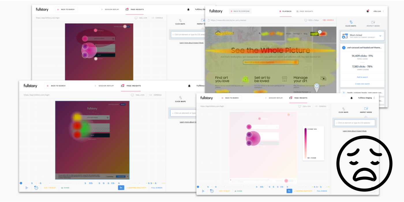
Early experiments in Sketch were bad. I made the decision to work directly in the client code.
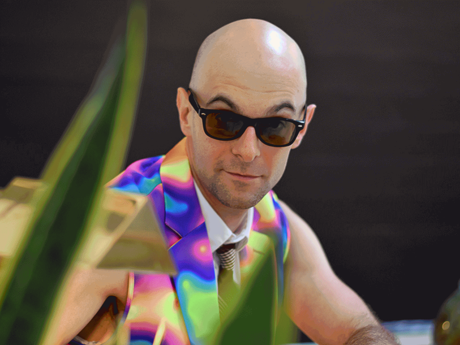
I would undertake the work only if given $90 (cost at the time) to purchase this sweet heat map suit to be worn during all subsequent presentations and events related to heat maps.
Photos by Alex Torres
In about a month’s time we had been presented with a serious business problem and delivered a working solution, officially dubbed Engagement Heatmaps. In the following months, with a new landing page and corresponding feature, conversion on the same search was up 27%.
As for the feature itself, adoption wasn’t seriously improved. Overall the effort was deemed a success given the efficient, economical approach (cost of labor + $90 for sweet suit) and the positive conversion outcome.
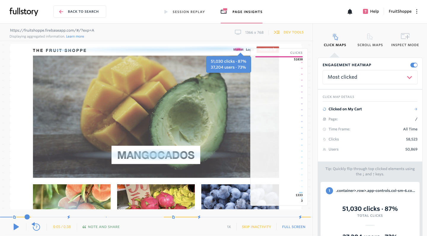
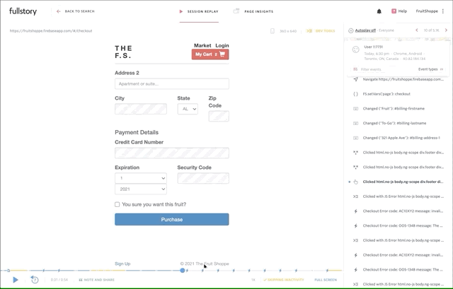
A heatmap as seen on the FruitShoppe live demo site.
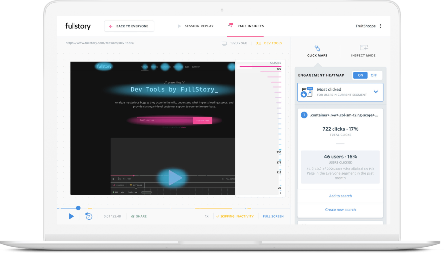
Interactive visualization scale.
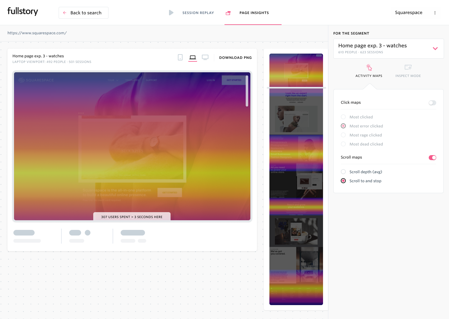
Designing in code gave us more time to test little bits and pieces with real users. This distributed scale, which flies out on hover, wasn't part of the initial scope, but we were able to test it during interviews. Users found it clarifying and liked it, so we shipped the feature.
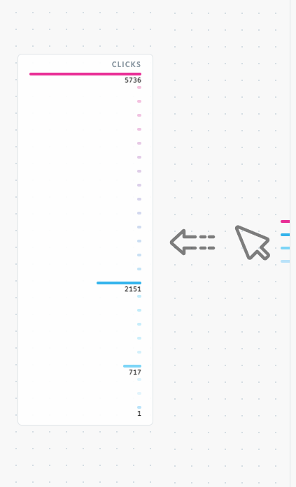
Heatmaps on or off.
While users overwhelmingly identified our prototype as a heat map, many of them, being made aware of Click Maps for the first time, thought that was a better analytical mode. Since everything was done in the client code, we kept both visual modes. Heatmaps for quick insights, Click Maps for deeper analysis.
Discovery concept scroll map prototype screen, Figma · Spring 2019.
Discovery concept scroll-to-and-stop map prototype screen, Figma · Spring 2019.